AstraLuna
Premium tea brand
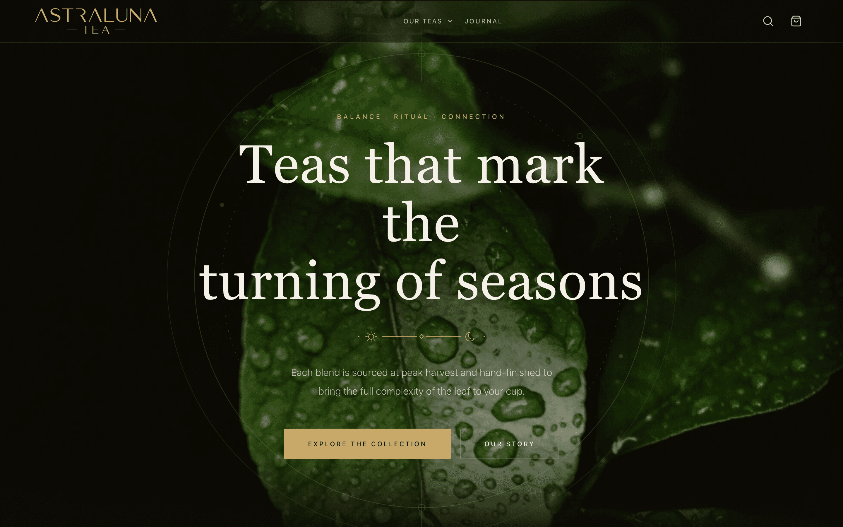
AstraLuna is a headless Shopify storefront for a premium loose-leaf tea brand. The celestial identity runs on lunar geometry over warm matte black, champagne-gold fine-line work and tin-label typography, with star and moon held in balance. A bespoke set of Celestial SVG ornaments, arched “tin label” cards and hairline frames give every section a crafted, editorial feel.
The whole brand is built on a single idea: the sun and the moon held in balance on one quiet line. It’s for people who treat a cup as a ritual, so where other tea sites reach for brightness and botanical clutter, AstraLuna is composed, nocturnal and precise: a night sky rendered as a scientific diagram of orbits, meridians and a sun-and-moon emblem.
Stack & architecture
I designed the stack on the newest Next.js 16 (App Router, Turbopack): a typed Shopify Storefront client via graphql-request, a two-tier ISR revalidation policy documented as a single source of truth, the Shopify cart API behind a client cart, and a full SEO / JSON-LD system.
Visual design
I created the Observatory identity from the ground up (champagne-gold fine-linework and cream type on warm matte black), plus a bespoke set of Celestial SVG ornaments: the sun · rule · star · rule · moon divider, orbit rings, and a Sun / Balance / Moon triptych, with arched “tin-label” cards that echo the sticker labels on the tins.
Polish & finish
The craft lives in the restraint: hairline frames that warm to gold on hover, orbit rings and copper radial glows behind the hero, pinprick stars on dark bands, gold-fill CTAs with ink text, and centred label compositions (eyebrow, serif-caps title, divider, note) that repeat for a consistent, editorial rhythm.
Bespoke visual identity
A dark-first token system, a reusable Celestial ornament set (lunar divider, orbit rings, star/moon triptych) and arched tin-label cards.
Full commerce build
Collections, product detail, search and CMS pages on the Shopify cart API, with a dark-glass cart drawer and gold checkout.
SEO & structured data
A central SEO layer generates canonicals, Open Graph and schema.org JSON-LD per route (Product, Collection, Article), with a branded, generated OG card as the fallback.
Editorial composition
Centred label compositions (eyebrow, serif-caps title, lunar divider, note) repeat across the site for a consistent, refined rhythm.
Palette
Typography
Cormorant Garamond, a high-contrast serif, carries display and “tin-label” lettering; DM Sans, kept light and never bold, handles body, navigation and UI. The tension between the two is the typographic expression of balance.
Signature details
- Gold is an accent, never a fill: roughly 70% warm black, 8% champagne gold, 2% copper and cream detail.
- The AstralunaDivider replaces every plain horizontal rule across the site.
- Arched cards are the only curve; everything else sits on squared 2-4px radii.
- The voice is tuned to match: composed, precise and warm, in the spirit of “Balance isn’t found. It’s practiced.”
- Next.js 16 with Turbopack, App Router and time-based ISR, with every route segment kept in sync with its data fetch via a documented revalidation policy.
- Typed Storefront API client via graphql-request; featured collections driven by env config.
- A dark-first token system rebuilt around the Observatory palette, with glass mixins retuned from green-tinted to warm black with gold hairlines.
- Cormorant Garamond display + DM Sans body, with serif and uppercase label mixins for the tin-label lettering.
Like what you see?
I’m available for freelance work. Let’s build something together.